Continuing their tradition of creative attention to detail, DC has released their decade variants for Catwoman: 80th Anniversary 100-Page Super Spectacular, complete with trade dress (title, logo, and other non-key-cover-art visual elements). Though Catwoman has had a few more solo efforts than Robin and thus has more material to draw from to create title treatments than the Boy (and Girl) Wonders, the cover designers still had a fair amount of creative extrapolation for the first three decades of her celebratory issue.
The main cover for the issue has not been fully released yet, only as text-less art by current (though outgoing) Catwoman writer/artist Joelle Jones. However, it almost certainly will use the current font for her run, developed for the New 52. Current writer and original artist for the Rebirth run, Joelle Jones, draws the cover. Interestingly, it does not highlight the most distinctive parts of her own redesign, the armpit cutouts.
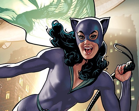
 1940s variant: Adam Hughes, known for his long run of spectacular covers for the mid-2000s Catwoman series, draws a joyful Catwoman backlit through her filmy green cape like a movie star. Like the 1940s Robin trade dress, they use a strong double bar of colors for the title treatment. The font used for “Catwoman” is a bit odd. Slightly similar to the small title treatment on Detective Comics #122 (from the 1940s), it’s irregular (likely due to the small size and hand lettering on the original cover), but instead of using the all-caps treatment, it uses an irregular, overlapping lower-case font which shares some strong similarities in letter shape, but is clearly distinct from the eighty-year-old lettering. Like the 1940s Robin treatment, this cover uses the same font for “80th anniversary 100-Page Super Spectacular.”
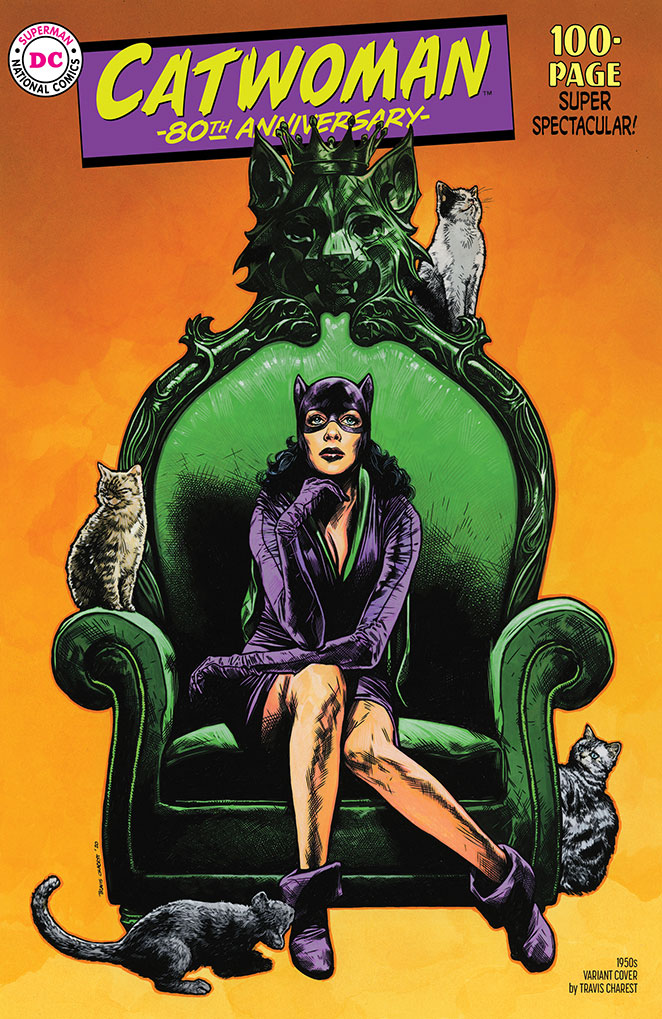
1950s variant: Travis Charest draws a wistful looking Catwoman on a green throne, surrounded by cats. Again, like the 1950s Robin cover, the title is slanted in a bordered box, similar to the Detective Comics logo in the 1940s cover featured above, though the Catwoman font attempts to capture her free-spirit personality with paintbrush-imitating line work, which doesn’t seem directly inspired by any “Catwoman” title treatment I could find. The slant of the “Catwoman” itself seems similar to the copy on the cover of Batman #65, but the paintbrush effect is unique. The rest of the trade dress is the same as the 1950s Robin cover.

1960s variant: Here we have a major divergence from the 60s Robin cover. This cheerful cover by J. Scott Campbell clearly draws from the Batman ‘66 television show – Campbell provided the lettering for the title as well as the tv-show-inspired heroine. This lettering mimics the Batman logo from the show, though extrapolated for the letters which do not appear in “Batman” – comparison provided from the Batman ‘66 comic from 2014. Interestingly, the cover treatment of Catwoman’s name does not provide any connection to Campbell’s lettering, which is clearly a cheeky imitation of Batman’s font. This is definitely one of Campbell’s strongest covers of recent memory, with Catwoman’s look and anatomy being fun, rather than too exaggerated. The rest of the trade dress is the same as the 1960s Robin cover.


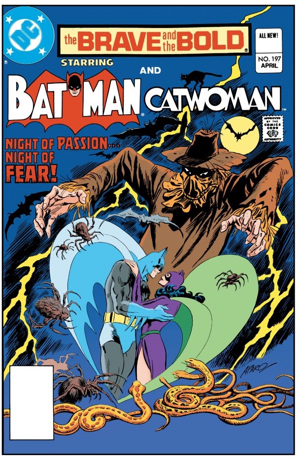
1970s variant: Frank Cho provides a richly flowing dark green cape for his 1970s Catwoman variant and beautifully designed and rendered elements throughout. For the title treatment, we have the first actual element taken from a historical Catwoman title – from (at least as far as I can determine) The Brave and the Bold #197, the famous (and recently reprinted as a Dollar Comic) tale of Batman and Catwoman’s marriage. However, this tale was from 1983, a few years too late to fairly count as the 70s – though I can see why they chose to use this treatment, as it’s the first actual title character treatment of Catwoman’s name, and it’s pretty close to the 80s, all things considered. I’m a bit sad that they couldn’t fit the little cat from The Brave and the Bold title on this cover. The rest of the trade dress is the same as the 1970s Robin cover.

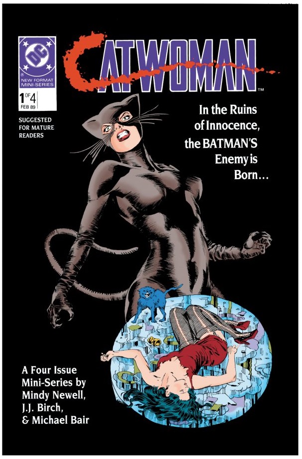
1980s variant: Artgerm gives us an uncharacteristically violent action shot for this cover, mimicking several details from the first cover of the 1989 four-issue miniseries – the whiskers, the angry attitude, and the dark tone – originally drawn by J. J. Birch. Though Artgerm’s work here is, as always, polished and detailed, it’s sadly not nearly as layered or complex as his recent work for the Joelle Jones run on the character. The title treatment also perfectly copies that of the miniseries, Catwoman’s first eponymous run, with its inkblot “C” and firm block letters. Unlike the Robin 1980s variant by Frank Miller, this cover has its own secondary text treatment, as it is not imitating The Dark Knight Returns’ trade dress.

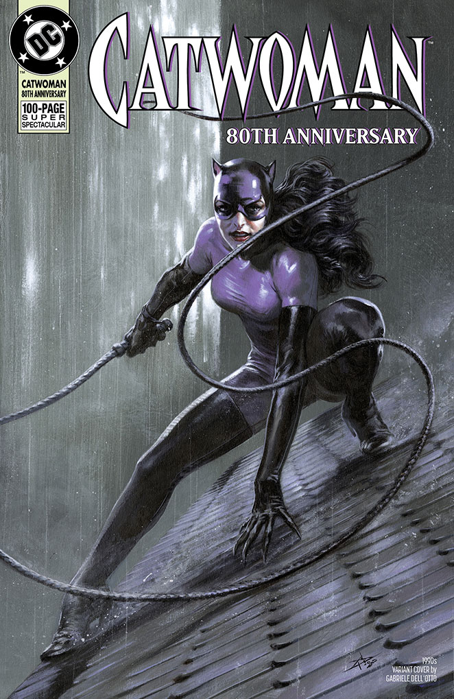
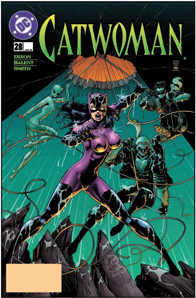
1990s variant: Gabriele Dell’Otto renders the Jim Balent costume quite well, with textured hair, rain, costume material, and rooftop tiles. Initially, the cover doesn’t seem quite as dramatic, but the level of detail does impress upon closer inspection. The trade dress cleanly copies that of the classic 1990s Catwoman, with its slightly irregular, spikey all-caps font. The rest of the trade dress is the same as the 1990s Robin cover.
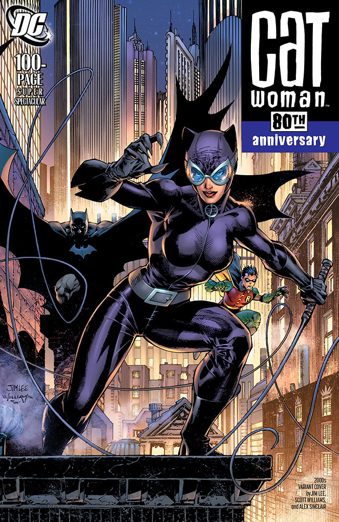
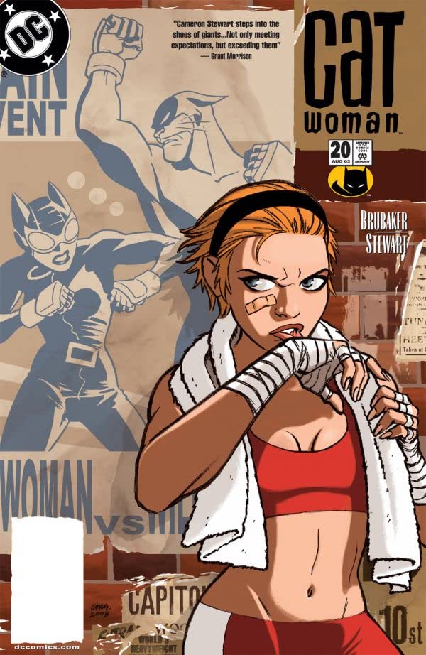
2000s variant: Jim Lee’s long-expected 2000s cover, in the suit designed by Darwyn Cooke and rendered lovingly throughout Lee’s work on Batman: Hush is very nice. It’s not quite as warm and humorous as his 1940s Robin variant, but a delight and fun tribute to Cooke’s design and his own most popular story. The title treatment provides a loving callback to the long-running Catwoman solo title of 2001 made famous by Ed Brubaker and Cooke, who was followed on art duties by Cameron Stewart. The iconic large lowercase “cat” over “woman” treatment brings back memories of the complexity and fun of that title, and the treatment of “100-Page Super Spectacular” is distinct from the 2000s treatment in the Robin variant.
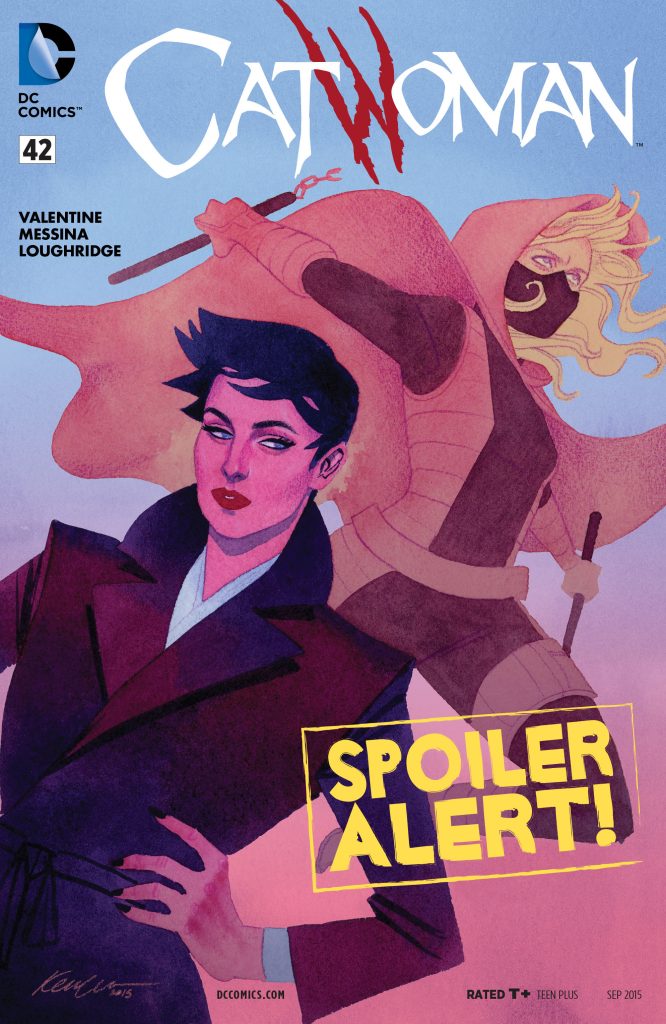
2010s variant: Jeehyung Lee paints Joelle Jones’s costume variation with its instantly recognizable armpit cutouts. Lee’s style is reminiscent of Artgerm’s or Derrick Chew’s, with its use of light, texture, and softer and more rounded shapes, quite different from Jones’ thick, incredibly flexible and carefully constructed lines. The title treatment copies that used for both the New 52 and Rebirth Catwoman solo titles (seen here with Kevin Wada’s cover for the New 52 run – and you knew I had to pick the cover with Stephanie Brown on it), with it’s angular, aggressive but not overly pointed font, and a signature red claw-like “W”. The “80th Anniversary” mimics this title font, similar to how the 2010s Robin variant imitated the “Robin” font. “100-Page Super Spectacular,” however, uses the same font as the Robin variant.

