
The Artwork
In this article I’d like to take a look at the artwork for Batman as provided by Andy Kubert and Eduardo Risso. As most of you readers know the Batman in this Flashpoint series is Thomas Wayne as Bruce Wayne died as a child and his aggrieved father took up the mantle of the Bat. It stands to reason that the two aforementioned artists would like to lend their own perspective to this Batman as opposed to the classic Bruce Wayne Batman.
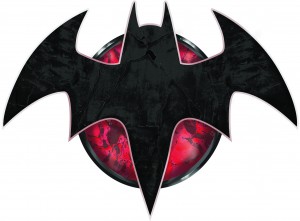
Before we get to that let’s take a look at the Flashpoint Bat symbol first. As seen above it has a certain aerodynamic feel to it, as if it was ready to have two jet nacelles attached to it and turn it into the “Bat-Wing” itself. Contrast this with the classic Bat symbol and one from the recent movies as pictured below.
All are supposed to be menacing in their own right but the most obvious difference is the inclusion of the red oval behind the Batman Flashpoint symbol. It connotes a different threat; perhaps a murderous bent as the Batman in Flashpoint is indifferent to the fate of his foes and is just as likely to throw them off a roof as he is to incarcerate them.
The color red is powerfully symbolic. It is often associated with passion in art circles and we often find in works of fiction it is closely related to blood. Specifically, the spilling of it.
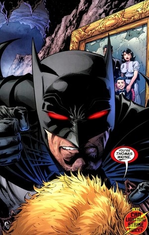
It’s no surprise that Andy Kubert has chosen the eyes of his Batman to be red. They gratuitously transmit the anger this Batman feels and they give him an other-worldly demonic feel.
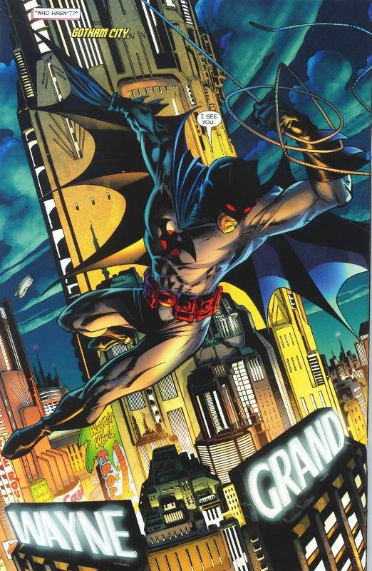
I’m fascinated with the way Kubert has chosen to draw this Batman. Readers will know this is a much older Batman, something akin to the age of the Bruce Wayne in the “Batman Beyond” series, but perhaps not quite as advanced in years. Despite the advanced years, this is a heavily muscled Batman that swings with ease through the concrete caverns of Gotham City. The above illustration owes a lot to the colorist Alex Sinclair and inker Sandra Hope. You’ll note the presence of the red to add that menacing look but take a look at the use of yellow here. Naturally, this color is provided by the city lights as reflected on the background buildings. But look what it does to the figure of Batman as he soars above. The menace is accentuated by this color and adds a fearsome quality to Batman. Yellow is often associated with fear (ask Green Lantern) as it is with cowardice. I don’t think the artists are saying this Batman is cowardly but one could infer from the use of yellow and Thomas Wayne’s proclivity for tossing perps off rooftops that he doesn’t have the courage to dispose of his foes in a more judicious manner.
Kubert draws this Batman with the grace and agility of a younger man. You’ll note the pointed toe and the recessed right leg of a practiced athlete. Even with the advanced years this is a well-conditioned Batman.
The head is cocked to the left to survey the city below like some merciless raven and the cape has a sharp shorter quality to it. This might be due to the use of perspective but I’d like to think Kubert has shortened the cape to reflect a more aquiline look, a sort of predatory eagle like structure that befits this crepuscular avenger.
In contrast stands the Batman of Eduardo Risso. As we see below his Batman has a more solid barrel chested look. This is first revealed as we see Thomas Wayne in civilian clothes.
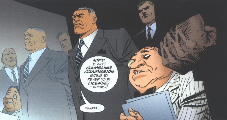
The face seems to be in a perpetual scowl accentuated by an iron jaw. The advanced years are evidenced by the graying hair and the wrinkled weathered face. Risso’s Wayne looks as though he could have been a party boss in the old Soviet Union.

The costumed Batman as drawn by Risso has the same qualities as the civilian Wayne. A big, hulking, massive figure as opposed to the more graceful and athletic Batman as drawn by Kubert. Most of Risso’s Batman drawings have him hidden in shade or only exposed to half-light. I chose the above panel because it shows us how large the head is drawn. It suits the barrel chested body and makes this Batman all the more intimidating.
I’m looking forward to examining the artwork further as these series progresses. I want to see how each of the artists handles Batman when faced with fear or perhaps some inescapable situation. Hopefully the two styles will remain distinct from each other so we can gain further insight into this Sphinx like beast that is the Thomas Wayne Batman.
Posted by Dave Healey