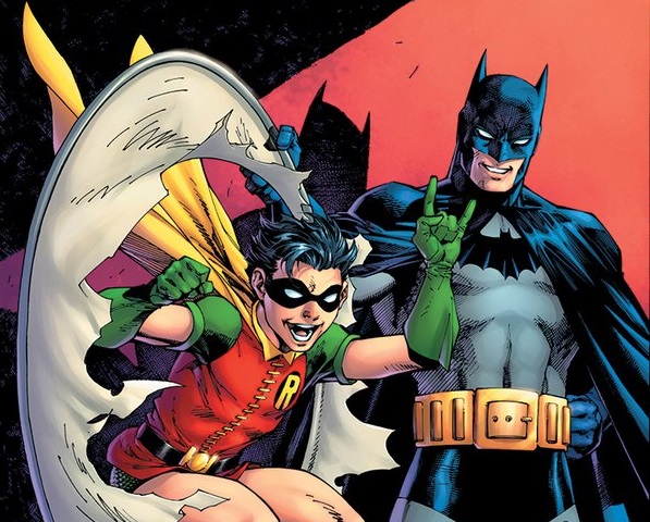
DC has just released their decade variants for Robin: 80th Anniversary 100-Page Super Spectacular with trade dress (the title, logo, and other non-key-cover-art visual elements) and they are marvelous to behold in their loving attention to detail to the various trade dresses of the decades they represent. All the more impressive, considering that until the 1990s, Robin did not have an ongoing solo upon which to base their logos, as they have with Detective Comics, Action Comics, and Wonder Woman with their last three 100-page anniversary specials. We decided to pull together a bit of detail to show the fruit of their attention to detail and the history of these cover trade dresses.
First off, Jim Lee’s beautiful re-creation of Detective Comics #38 in the 1940s, including a loving rendering of the gaudy gothic font introducing Robin. I love all of this, including the little “ROBIN” circle at the top replacing the “BATMAN” circle of the original.


Second, Julian Totino Tedesco’s gorgeous 1950s variant, including a rendering of “ROBIN” imitating the font in the title pages of comics from that time, such as Detective Comics #200, while the box and angle of the title mimic the placement on Detective Comics of the same issue.


Third, Dustin Nguyen provides a lovely and trippy homage to the 1960s, with title font and box appearing to mimic the placement of “Detective Comics” in such issues as #363, but not the font on that cover’s treatment of Robin, interestingly – it lacks all serifs, significantly. The added “DCE” mimicking the classic Comics Code box is an additional touch of fun detail.


Fourth, Kaare Andrews gives us a 1970s Robin, with a font that seems to mimic covers treatment such as Detective Comics #395, though with traces that seem to be similar to the Detective Comics of the late 1990s digital/blocky treatment.


Fifth, Frank Miller gives us his creation Carrie Kelley, clearly working off of his most famous image ever, the cover to The Dark Knight Returns #1 (though #3 actually featured Carrie on the cover). The title treatment clearly imitates that iconic work’s cover.


Sixth, Jim Cheung gives us a powerful treatment of Tim Drake and an upside-down Batman, and we see the iconic logo developed first for Tim’s miniseries, then his ongoing in the 1990s. Interestingly, Cheung’s cover does not use a color shift for the title, as the series did.


Seventh (and my personal favorite, obviously), Derrick Chew creates a luminous Stephanie Brown cover for the 2000s. Title treatment is the same as the 90s cover, though again with flat colors instead of a shift. Chew shows Steph swinging feet first, rather than blaze of hair first.


Eighth and lastly, Yasmine Putri draws ALL of the Robins with the lovely title treatment first seen in the Robin Rises one-shots, which then transferred to the Robin: Son of Batman series. Probably wisely, DC did not use the We Are Robin graffiti style, though it was fitting for that series concept and quite striking.


