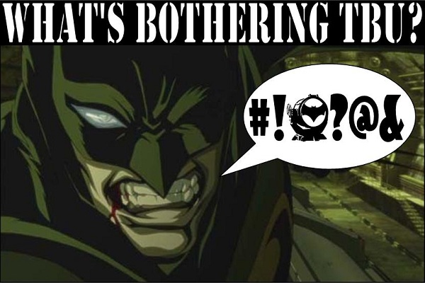
I thought I'd start off with a light-hearted one… you know what's been bothering me? CGI in traditional animations! Here's an example; taken from 'Year One':

Now you may be thinking to yourself, "That's not that bad", you may even be thinking "What the hell is he moaning about now?" but to you I say take a closer look! Specifically, take a look at the car! A CGI car, to be precise, edited into a traditional cell animation.
Admittedly, this image doesn't look too bad but in no way does it do the blasphemy justice! Please, I'm sure you all own a copy of this film and I request you watch it again, paying close attention to the vehicles, that is if you haven't noticed it already. I assure you I am in no way trying to ruin animations for you… I just want you to feel my pain!
I would like to point out that I am a huge animation fan, particularly DC's exceptionally great animated films, but they are spoiled when these plastic looking CGI images are just pasted into them. There has been a real increase in the use of this technique in recent years and I understand it; it can be really difficult to keep perspectives correct in awkward shots, particularly with vehicles, but animators used to get on fine with the hard work. It's just distracting to see something in a film that you can just tell shouldn't be there- like watching the remastered Star Wars original trilogy (and don't get me started on that!).
The whole point of these CGI shots is ease for the animator but they are supposed to look seamless, the image is created using a 3D mapping software but rendered in 2D, this means that the perspectives and the shadows stay accurate… but it looks awful! It genuinely upsets me to see it in animated films because it's so distracting that it takes me right out of the film.
Well that's all for now, I hope you found this entertaining and if not, well I'm sure a member of TBU will rant about something you agree with soon. I just needed to get this off my chest. Thank you.
Posted by Joe Jinks